連載
富山県民を分類してみたら……?――クラスタリング分析の手法:ITエンジニアのためのデータサイエンティスト養成講座(8)(2/4 ページ)
あるグループを属性ごとに分類する「クラスタリング分析」の基本を学ぼう。今回も自治体が公開しているオープンデータを題材にします。
SciPyのkmaens関数を使ったクラスタリング分析
それではテストデータを使ってクラスタリング分析を行ってみましょう。
IPythonを起動して必要なライブラリを読み込み、テストデータを定義します(In [1]〜In [6])。
散布図で表示してみると図1のような6つのデータが表示されます。
In [1]: # ライブラリのインポート
In [2]: %pylab
Welcome to pylab, a matplotlib-based Python environment [backend: TkAgg].
For more information, type 'help(pylab)'.
In [3]: import pandas as pd
In [4]: # テストデータの定義
In [5]: sample = {'x' : [1, 1, 2, 4, 4, 5], 'y' : [1, 2, 1, 3, 5, 4]}
In [6]: df = pd.DataFrame(sample)
In [7]: # グラフ表示(散布図)
In [8]: plt.scatter(df.x, df.y)
Out[8]: <matplotlib.collections.PathCollection at 0x4bd7c50>
In [9]: # グラフを閉じる
In [10]: plt.close()

SciPyのkmeans2関数を使ったクラスタリング
データの準備ができたので、kmeans2関数を使ってクラスタリングしてみましょう。
SciPyにはkmeansとkmeans2の2つの関数が用意されていますが、一般的なK平均法アルゴリズムを持つkneans2を使います。
ライブラリをインポートしてkmeans2関数を実行します(In [11]〜In[14])。
この関数は2つの戻り値を持ちます。「centroid」には各クラスターの中心点を、「label」にはクラスターの分類が返されます。
3つのデータずつ、2つのクラスターに分類されていることが確認できます(In [15]〜In [20])。
In [11]: # K平均法のライブラリをインポート
In [12]: from scipy.cluster.vq import kmeans2
In [13]: # K平均法で2つのクラスターに分割
In [14]: centroid, label = kmeans2(array(df),2)
In [15]: # 各クラスターの中心の確認
In [16]: center = pd.DataFrame(centroid)
In [17]: center
Out[17]:
          0         1
0  4.333333  4.000000
1  1.333333  1.333333
In [18]: # 各クラスターのラベルを追加してクラスターを確認
In [19]: df['cluster'] = label
In [20]: df
Out[20]:
   x  y  cluster
0  1  1        1
1  1  2        1
2  2  1        1
3  4  3        0
4  4  5        0
5  5  4        0
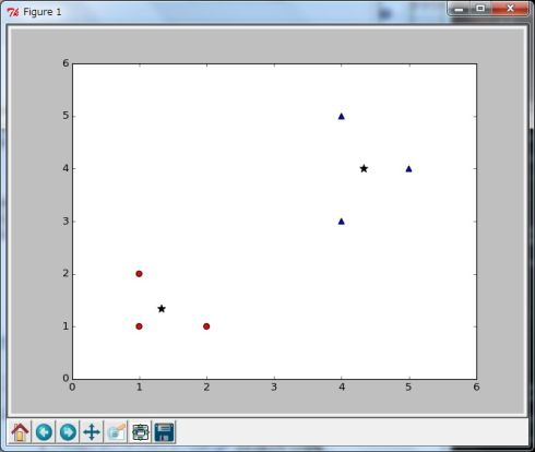
では結果をグラフに表示して確認してみましょう。
今回のケースでは、中心点を星印(★)で表示し(In [22])、最初のクラスターを赤い円で(In [24])、2番目のクラスターを青い三角(In [25])で表示させています。こうすることで、クラスターの分類が視覚的にも確認することができます(図7)。
In [21]: # クラスターの中心をグラフに表示
In [22]: plt.scatter(center[0], center[1], s=80, c='k', marker='*')
Out[22]: <matplotlib.collections.PathCollection at 0x4cded50>
In [23]: # 各クラスターをグラフに表示
In [24]: plt.scatter(df[df['cluster'] == 0].x, df[df['cluster'] == 0].y, s=40, c='r', marker='o')
Out[24]: <matplotlib.collections.PathCollection at 0x4d0a410>
In [25]: plt.scatter(df[df['cluster'] == 1].x, df[df['cluster'] == 1].y, s=40, c='b', marker='^')
Out[25]: <matplotlib.collections.PathCollection at 0x7b842f0>
In [26]: # グラフを閉じる
In [27]: plt.close()
Copyright © ITmedia, Inc. All Rights Reserved.