Webデザイン初心者でもできる、Bootstrapの使い方超入門(3/4 ページ)
» 2016年04月11日 05時00分 公開
[山崎 大助,デジタルハリウッド大学院 非常勤講師/INOP/U-SYS]
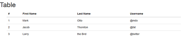
Bootstrapデフォルトのテーブルスタイル
Bootstrapのテーブルは、以下ルール内で使用しましょう。
  <div  class="container">
    <table class="table">
    <thead>
      <tr>
        <th>#</th>
        <th>First Name</th>
        <th>Last Name</th>
        <th>Username</th>
      </tr>
    </thead>
    <tbody>
      <tr>
        <td>1</td>
        <td>Mark</td>
        <td>Otto</td>
        <td>@mdo</td>
      </tr>
      <tr>
      <td>2</td>
      <td>Jacob</td>
        <td>Thornton</td>
        <td>@fat</td>
      </tr>
      <tr>
        <td>3</td>
        <td>Larry</td>
        <td>the Bird</td>
        <td>@twitter</td>
      </tr>
    </tbody>
  </table>
  </div>
sample3.htmlから抜粋
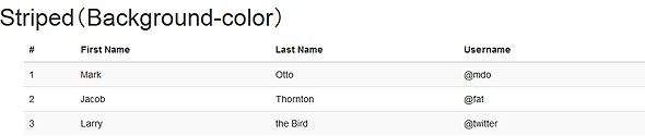
1行間隔で背景色を変える
table要素のclassに対して「table-striped」を追加すると、1行間隔で背景色を変えることができます。
    <div  class="container">
      <table class="table table-striped">
……
sample3.1.htmlから抜粋
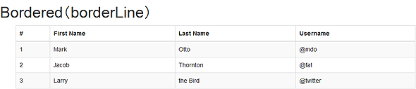
枠線を追加する
table要素のclassに対して「table-bordered」を追加すると、テーブルに枠線を追加できます。
    <div  class="container">
      <table class="table table-striped table-bordered">
……
sample3.2.htmlから抜粋
マウスオーバー時のエフェクトを追加する
table要素のclassに対して「table-hover」を追加すると、テーブルにマウスオーバーしたときのエフェクトを追加できます。
    <div  class="container">
      <table class="table table-striped table-bordered table-hover ">
……
sample3.3.htmlから抜粋,http://sample.atmarkit.jp/fux/1403/19/sample3.3.html
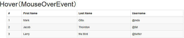 sample3.3.html(#が2の行をマウスオーバーしている)
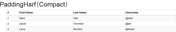
padding値を通常の半分にする
table要素のclassに対して「table-condensed」を追加すると、テーブルのpadding値を通常の半分にすることができます。
    <div  class="container">
      <table class="table table-striped table-bordered table-hover table-condensed">
……
sample3.4.htmlから抜粋
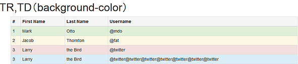
セルの背景色を変える
tr要素/td要素のclassに対して「active」「success」「warning」「danger」「info」のいずれかを指定すると、それぞれの値に対応した背景色にすることができます。
    <div class="container">
      <table class="table table-striped table-bordered table-hover table-condensed">
      <thead>
        <tr class="active">
……
        <tr class="success">
……
        <tr class="warning">
……
        <tr class="danger">
……
        <tr class="info">
……
sample3.5.htmlから抜粋
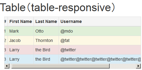
テーブルをレスポンシブ対応する
「div class="container"」要素とtable要素の間に「div class="table-responsive"」要素を追加すると、テーブルをレスポンシブ対応できます。具体的に言うと、ブラウザーウィンドウを狭くすると、table要素内にスクロールバーが出現します。
    <div class="container">
      <div class="table-responsive">
      <table class="table table-striped table-bordered table-hover table-condensed">
……
sample3.6.htmlから抜粋
関連記事
 「Bootstrap 4 alpha」が登場
2015年8月19日(米国時間)、オープンソースCSSフレームワーク「Bootstrap 」の最新バージョン「Bootstrap 4 alpha」がリリースされた。 中の人に聞く、Bootstrap対応を強化するDreamweaverの新機能と今後、コーディングが捗る裏技とは
もうすぐ2015年2度目の大きな機能追加が予定されているDreamweaverについて、機能追加の方向性や、あまり知られていない裏技などを開発担当者に聞いた。 【第27回 HTML5とか勉強会レポート】 LESSやTwitter Bootstrapで簡単デザイン
LESSやTwitter Bootstrapなどのツールを利用した、スマートなデザイン方法など、デザイン面にフォーカスされたHTML5とか勉強会レポート
Copyright © ITmedia, Inc. All Rights Reserved.
SpecialPR
アイティメディアからのお知らせ
スポンサーからのお知らせPR
SpecialPR


注目のテーマ

システム開発ノウハウ 【発注ナビ】PR
編集部からのお知らせ
あなたにおすすめの記事PR
 ITmediaはアイティメディア株式会社の登録商標です。