[解決!Python]Excelワークシートに折れ線グラフを作成するには(OpenPyXL):解決!Python
OpenPyXLを使って、Excelワークシートに折れ線グラフを描画し、その線やマーカーの設定を変更する方法を紹介する。
この記事は会員限定です。会員登録(無料)すると全てご覧いただけます。
from openpyxl import Workbook
from openpyxl.chart import Reference, LineChart
wb = Workbook()
ws = wb.active
values = [
('YEAR', 'A', 'B', 'C'),
(2017, 600, 450, 400),
(2018, 550, 500, 350),
(2019, 750, 650, 450),
(2020, 600, 750, 550),
(2021, 800, 650, 500)
]
for v in values:
ws.append(v)
rmin = ws.min_row
rmax = ws.max_row
cmin = ws.min_column
cmax = ws.max_column
chart = LineChart()
src = Reference(ws, min_col=cmin+1, min_row=rmin, max_col=cmax, max_row=rmax)
chart.add_data(src, titles_from_data=True)
cat = Reference(ws, min_col=cmin, min_row=rmin+1, max_row=rmax) # 項目名の設定
chart.set_categories(cat)
chart.title = 'Sample Chart' # グラフタイトル
chart.x_axis.title = 'YEAR' # 軸ラベル
chart.y_axis.title = 'SALES'
chart.anchor = 'A8' # グラフの表示位置
chart.width = 16 # グラフのサイズ
chart.height = 8
ws.add_chart(chart)
wb.save('sample_chart.xlsx')
# 線の色を変更する
chart.ser[0].graphicalProperties.line.solidFill = "FF0000"
chart.ser[1].graphicalProperties.line.solidFill = "00FF00"
chart.ser[2].graphicalProperties.line.solidFill = "0000FF"
wb.save('sample_chart.xlsx')
# 線種を変更する
# 設定可能な値:'lgDash', 'sysDash', 'dashDot', 'solid', 'sysDashDot',
# 'lgDashDotDot', 'dot', 'sysDot', 'sysDashDotDot', 'dash', 'lgDashDot'
chart.ser[0].graphicalProperties.line.dashStyle = 'sysDashDot'
chart.ser[1].graphicalProperties.line.dashStyle = 'lgDash'
chart.ser[2].graphicalProperties.line.dashStyle = 'sysDashDotDot'
wb.save('sample_chart.xlsx')
# 線の太さを変更する
chart.ser[0].graphicalProperties.line.width = 10000
chart.ser[1].graphicalProperties.line.width = 20000
chart.ser[2].graphicalProperties.line.width = 30000
wb.save('sample_chart.xlsx')
# 線を滑らかにする
chart.ser[0].smooth = True
wb.save('sample_chart.xlsx')
# マーカーを変更する
# 設定可能な値:'x', 'auto', 'picture', 'star', 'diamond', 'plus', 'dot',
# 'square', 'dash', 'triangle', 'circle'
chart.ser[0].marker.symbol = 'x'
chart.ser[1].marker.symbol = 'star'
chart.ser[2].marker.symbol = 'diamond'
wb.save('sample_chart.xlsx')
# マーカーの色を変更する
chart.ser[0].marker.graphicalProperties.line.solidFill = "FF0000"
chart.ser[1].marker.graphicalProperties.line.solidFill = "00FF00"
chart.ser[2].marker.graphicalProperties.line.solidFill = "0000FF"
wb.save('sample_chart.xlsx')
# グラフの種類を変更する
chart.grouping = 'stacked' # 積み上げ折れ線グラフ
chart.grouping = 'percentStacked' # 100%積み上げ折れ線グラフ
chart.grouping = 'standard' # 折れ線グラフ
wb.save('sample_chart.xlsx')
サンプルのワークシート
本稿では主に以下のコードで作成したワークシートを例に取る。
from openpyxl import Workbook
wb = Workbook()
ws = wb.active
values = [
('YEAR', 'A', 'B', 'C'),
(2017, 600, 450, 400),
(2018, 550, 500, 350),
(2019, 750, 650, 450),
(2020, 600, 750, 550),
(2021, 800, 650, 500)
]
for v in values:
ws.append(v)
これをExcelで表示したものを以下に示す。
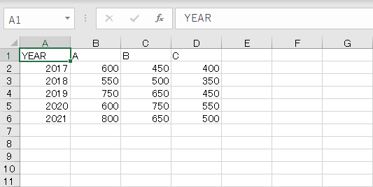 サンプルのワークシート
折れ線グラフ
OpenPyXLを使って折れ線グラフを作成するには、openpyxl.chart.LineChartクラスを使用する。その手順は以下の通り。
- Referenceクラスを使って、グラフ作成の基となる範囲を指定する
- LineChartクラスのインスタンス(グラフ)を生成する
- グラフのタイトル、軸ラベル、項目名などの設定を行う
- グラフにデータ(上で作成したReferenceクラスのインスタンス)を渡す
- ワークシートにグラフを挿入する
折れ線グラフ(LineChart)で設定できる項目としては以下がある(一部)。
| 属性 | 説明 |
|---|---|
| title属性 | グラフのタイトル |
| x_axis.title属性 | X軸のラベル |
| y_axis.title属性 | Y軸のラベル |
| anchor属性 | ワークシート上での表示位置(左上) |
| width属性 | グラフの横幅 |
| height属性 | グラフの高さ |
| grouping属性 | グラフの種類 |
| set_categoriesメソッド | X軸の項目名の設定 |
| ser属性 | 系列ごとのマーカーや線種の設定 |
| 折れ線グラフに設定可能な項目(一部) | |
LineChartクラスを使って、折れ線グラフを作成する基本的な方法を以下に示す。
from openpyxl.chart import Reference, LineChart
rmin = ws.min_row
rmax = ws.max_row
cmin = ws.min_column
cmax = ws.max_column
chart = LineChart()
src = Reference(ws, min_col=cmin+1, min_row=rmin, max_col=cmax, max_row=rmax)
chart.add_data(src, titles_from_data=True)
cat = Reference(ws, min_col=cmin, min_row=rmin+1, max_row=rmax) # 項目名の設定
chart.set_categories(cat)
chart.title = 'Sample Chart' # グラフタイトル
chart.x_axis.title = 'YEAR' # 軸ラベル
chart.y_axis.title = 'SALES'
chart.anchor = 'A8' # グラフの表示位置
chart.width = 16 # グラフのサイズ
chart.height = 8
ws.add_chart(chart)
wb.save('sample_chart.xlsx')
title属性、X軸とY軸のタイトルなど、グラフ描画で必要になりそうな項目については上のコードに示した通りだ(「OpenPyXLを使ってExcelワークシートに棒グラフを作成するには」ではもう少し詳しく取り上げているので、そちらも参考にされたい)。
このコードでは、グラフ描画の基となるセル範囲を変数srcに、X軸の項目名として使用するセル範囲を変数catに設定している。このとき、変数srcには凡例として使用する部分まで含めて、LineChartオブジェクトにadd_dataメソッドでデータを追加する際に「titles_from_data=True」を指定している。これはOpenPyXLでグラフを描画する際の典型的な手段である。
このコードを実行した結果を以下に示す。

以下では折れ線グラフの線やマーカーを設定する方法を紹介する。
折れ線グラフの線を設定する
折れ線グラフの線やマーカーを系列別に設定するには、LineChartインスタンスのser属性を使用する。この属性はグラフの系列ごとの描画情報を格納している。線の色や種類、太さを変更するにはこの属性のgraphicalProperties属性を使用する。
例えば、線の色を設定するにはgraphicalProperties.line.solidFill属性にRGB値を指定する。以下はその例だ。
chart.ser[0].graphicalProperties.line.solidFill = "FF0000"
chart.ser[1].graphicalProperties.line.solidFill = "00FF00"
chart.ser[2].graphicalProperties.line.solidFill = "0000FF"
既に述べたが、ser属性にはグラフの描画情報が系列ごとに格納されている。上のグラフでは系列は3つあるので、ser属性の要素数は3つある(インデックスは0〜2となることに注意しよう)。上のコードでは、3つの要素のgraphicalProperties.line.solidFill属性に赤(FF0000)、緑(00FF00)、青(0000FF)を設定している。
これによりグラフは次のようになる。

グラフの線色が変わったことを確認されたい。
線種(実線、点線など)を設定するには、graphicalProperties.line.dashStyle属性を使用する。設定可能な値は'lgDash'/'sysDash'/'dashDot'/'solid'/'sysDashDot'/'lgDashDotDot'/'dot'/'sysDot'/'sysDashDotDot'/'dash'/'lgDashDot'のいずれかだ。以下に例を示す。
chart.ser[0].graphicalProperties.line.dashStyle = 'sysDashDot'
chart.ser[1].graphicalProperties.line.dashStyle = 'lgDash'
chart.ser[2].graphicalProperties.line.dashStyle = 'sysDashDotDot'
これによりグラフは次のようになる。

指定可能な値と線種の対応を以下に示す。
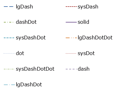 線種と実際に描画される線の対応
線の太さはgraphicalProperties.line.width属性にEMU単位で指定する。以下に例を示す。
chart.ser[0].graphicalProperties.line.width = 10000
chart.ser[1].graphicalProperties.line.width = 20000
chart.ser[2].graphicalProperties.line.width = 30000
実行結果を以下に示す。

最後に、折れ線ではなく、滑らかな線で点をつなぎたいときにはser属性の要素が持つsmooth属性をTrueにする。以下に例を示す。
chart.ser[0].smooth = True
wb.save('sample_chart.xlsx')
以下に実行結果を示す。赤い点線が滑らかに描画されていることに注目しよう。

折れ線グラフのマーカーを設定する
折れ線グラフのマーカーを設定するには、上でも見たser属性の各要素でmarker.symbol属性を使用する。設定可能な値は'x'/'auto'/'picture'/'star'/'diamond'/'plus'/'dot'/'square'/'dash'/'triangle'/'circle'のいずれかだ。以下に例を示す。
chart.ser[0].marker.symbol = 'x'
chart.ser[1].marker.symbol = 'star'
chart.ser[2].marker.symbol = 'diamond'
これにより、グラフは次のようになる。マーカーが追加されたことを確認しよう。

設定可能な値と実際に描画されるマーカーの対応を以下に示す。
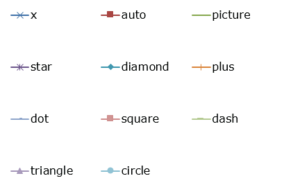 設定可能な値と描画されるマーカー
マーカーの色はmarker.graphicalProperties.line.solidFill属性で設定できる。以下に例を示す。
chart.ser[0].marker.graphicalProperties.line.solidFill = "FF0000"
chart.ser[1].marker.graphicalProperties.line.solidFill = "00FF00"
chart.ser[2].marker.graphicalProperties.line.solidFill = "0000FF"
実行結果は次の通り。

グラフの種類を変更する
折れ線グラフには以下のバリエーションがある。
- 折れ線グラフ:これまでに見てきた折れ線グラフ
- 積み上げ折れ線グラフ:各系列の値を合計したものをY軸の値とし、グラフを描画する
- 100%積み上げ折れ線グラフ:各系列の値を合計したものが100%となるように、グラフを描画する
グラフの種類を変更するにはグラフ(LineChartオブジェクト)のgrouping属性を'standard'(折れ線グラフ)、'stacked'(積み上げ折れ線グラフ)、'percentStacked'(100%積み上げ折れ線グラフ)のいずれかに設定する。
例えば、積み上げ折れ線グラフにするには次のようにする。
chart.grouping = 'stacked' # 積み上げ折れ線グラフ
これにより、グラフは次のようになる。

2017年の売り上げの合計が「600+450+400=1450」であり、Y軸を見ると、系列Cの売り上げがまさにその値になっていることに注目しよう。ただし、このような表現をするのであれば、線の下が塗りつぶされる積み上げ面グラフの方が分かりやすいかもしれない。
3D折れ線グラフ
LineChartクラスの代わりにLineChart3Dクラスを使うことで、上記のグラフを3D化できる。例えば、本稿の最初に示したグラフを作成するコードで、LineChartクラスをLineChart3Dクラスに置き換えると以下のようなグラフが得られる(コードは省略する)。

Copyright© Digital Advantage Corp. All Rights Reserved.
アイティメディアからのお知らせ


注目のテーマ

編集部からのお知らせ
![]() ITmediaはアイティメディア株式会社の登録商標です。
ITmediaはアイティメディア株式会社の登録商標です。